
Max Kohler
Germany-based graphics reporter Max Kohler has a portfolio website that really speaks to me as a project manager and organization nerd. He’s taken a love of spreadsheets to the next level with a graph-themed display of nearly ten years’ worth of content he’s created. He’s found a way to collect all of his projects, writing, teaching, and social media links in one place as a snapshot of his career. Initially it’s a bit overwhelming, but he’s implemented a purple-pink ombre in the background and a feature for the cursor to highlight specific cells, which makes the website straightforward to digest once you understand what you’re looking at.
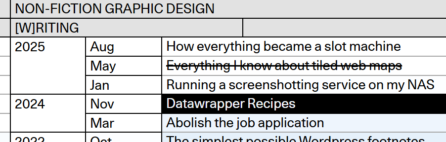
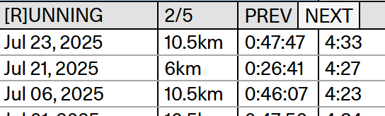
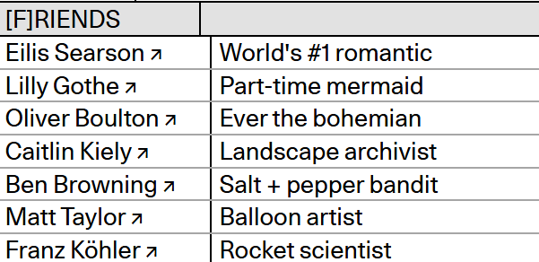
His personality also shows through. Despite the inherent formality of spreadsheets, you can tell he has a sense of humor. Beyond career-oriented topics like his past work and courses, he’s listed whimsical, non-career-related line items like his top running times, and his closest friends. It’s clear that Max is a silly person who takes his design and his work very seriously, which is an impression I want to emulate in my career.
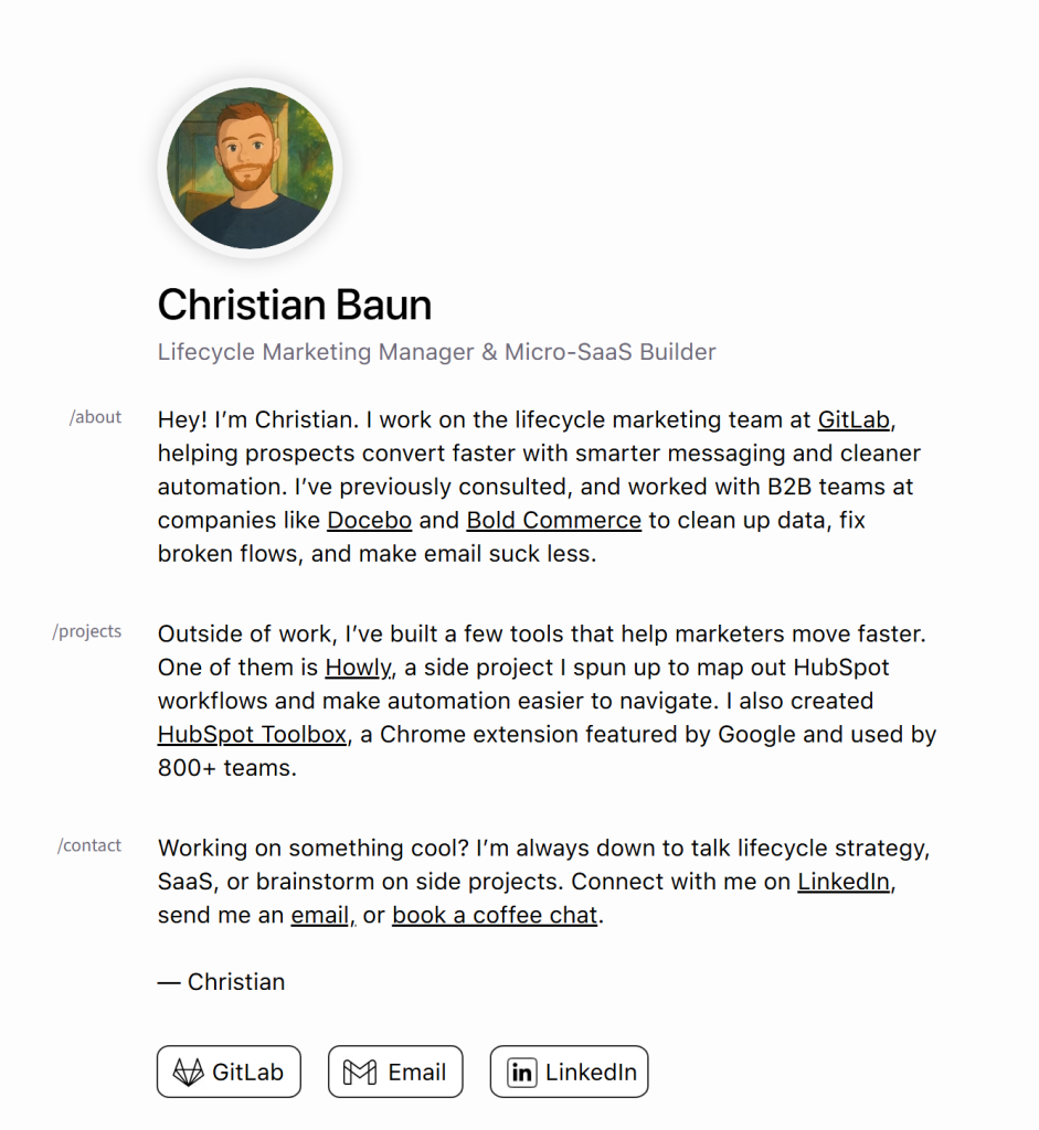
Christian Baun
This one was made with Wix, but I feel like there’s a trend or stereotype to Wix-made portfolios that this breaks out of. I associate Wix sites with oversized images, flashy templates, and several different pages splitting up portfolios, CVs, and a contact page. At the end of the day though, all most people really need is a one-pager that’s well-organized and easy to read, like this one.
This digital CV was made by Canadian marketing manager Christian Baum, and hits all the notes you want a CV to hit. He describes who he is, what he’s capable of, listed some past projects, and how best to reach him. He’s cleanly hyperlinked all the relevant projects and profiles so it’s easy to navigate to anything that would be pertinent to hiring him. You really can’t beat this kind of simplicity. I can definitely see myself whipping up a resume like this in the future, since it’s just a little more elevated than the traditional PDF and shows a base level of tech-savvy and aesthetic eye.
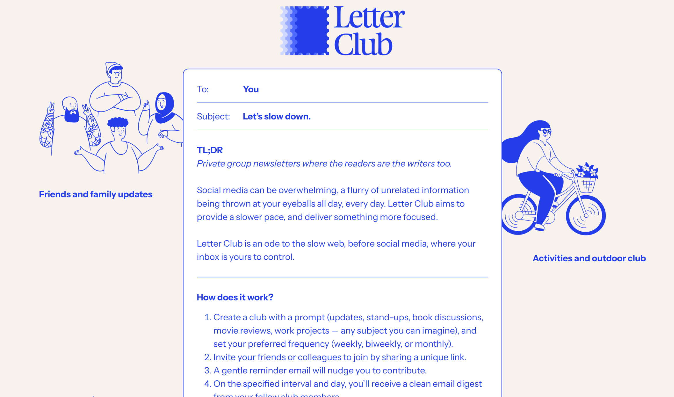
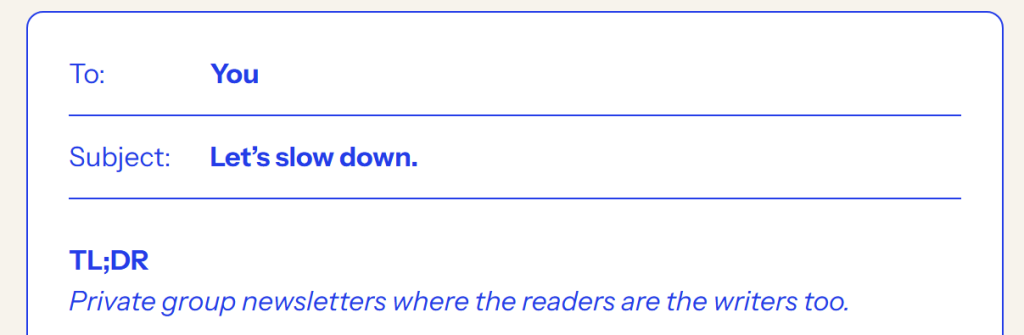
Letter Club
Letter Club has a website at the intersection of both encapsulating what the product is for, and a cute, colorful brand aesthetic. Often, flashy branding can backfire by not giving any kind of impression of what the product is about. However, the core of Letter Club’s website shows exactly what they’re about – emails. The necessary information is formatted like an email, which tells you right off the bat what this information is going to be about. Upon that, they’ve layered the fun doodles and blue text, but it doesn’t overpower the fact that it’s email-related.
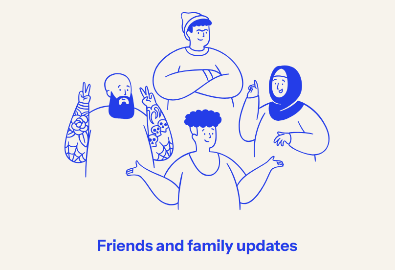
The blue doodles on the side illustrate different ways you could use Letter Club: for friends and family or for a club. It makes it easy to visualize yourself using Letter Club, and the website is tailored to move the images neatly to the bottom if you shrink your browser size, so it doesn’t clutter the text.
They’ve also got a call-to-action button at the bottom, drawing the eye down with the key blue color. I also appreciate that the button notes that it’s free, since that would be my first question as a potential user – and they’ve already answered it. Great marketing, great user acquisition, and a great overall design.

Leave a Reply