The <details> element has two parts: a <summary> and content.
<details>
       <summary>This is my summary!</summary>
       <p>This is my secret hidden information!</p>
</details>
The result looks like this:
This is my summary!
This is my secret hidden information!
This is exactly the foundation we need to create interactive dropdowns like FAQs, or organize information like on a Wikipedia page. The <summary> is the always-visible label that the user clicks to expand. Everything else inside <details> is the hidden content that appears on click.
Use a <p> or <span> for content. Headings inside <details> should be avoided, but if you need to use one inside a <summary>, set it to display: inline to avoid spacing issues.
Semantically, <details> should only be used to collapse information elegantly. It’s not a substitute for navigation menus, footnotes, or other elements that already have proper HTML equivalents.
open vs. closed
By default, <details> loads as collapsed. However, we can adjust that, using the open attribute selector.
<details open>
       <summary>This is my summary!</summary>
        <p>This information is NOT secret.</p>
</details>
The result loads like this:
This is my summary!
This information is NOT secret.
This is handy for things like instructions at the top of a form. Display them upfront, but let the user collapse them once they’ve read enough.
exclusivity
As of 2024, you can use the name attribute to create a group of dropdowns where only one can be open at a time. When one opens, any other with the same name automatically closes.
<details name="exclusive" open>
       <summary>First item</summary>
       <p>This information is NOT secret.</p>
</details>

<details name="exclusive">
       <summary>Second item</summary>
       <p>This information IS secret.</p>
</details>
The results behave like this:
First item
This information is NOT secret.
Second item
This information IS secret.
This is particularly useful for lengthy content, keeping content tidy as users browse.
styling with css
<details> accepts standard CSS just like any other element — background colours, borders, max-width, and so on.
To style individual parts of the element without adding classes or IDs, use these pseudo-elements:
details summary — the summary element itself
summary::marker — the little disclosure triangle
summary::after — useful for adding custom text or icons
details::details-content — the expanded content area (new as of September 2025; may still have Safari issues)
Use summary::after when adding toggle arrows, icons, or swappable text. Use details::details-content when styling the expanded section, or adding padding and backgrounds to the content container. See demos 4, 5, and 6 here to see it in action.
animating <details>
Edge and Chrome-based browsers already support simply adding transition and animate line items to CSS for <details>, but Firefox and Safari have yet to implement. It still is worth including these in your CSS, though, because even though your content will still statically snap open and shut on Firefox and Safari right now, when the browser support is added, it will immediately start working.
Alternatively, a workaround in the mean time is animating all the content that comes after the summary instead of targeting the <details> element directly.
details[open] summary ~ * {
  animation: open 0.3s ease-in-out;
}

@keyframes open {
  from { opacity: 0; transform: translateY(-10px); }
  to   { opacity: 1; transform: translateY(0); }
}
bonus: <details-utils>
Zach Leatherman (@zachleat on GitHub) created an open source web component called <details-utils> that wraps your <details> element and adds a suite of useful behaviours with no extra JavaScript to write yourself:
Click outside to close
Bind an optional close button
Close with the Escape key
More elegant open/close animation
Toggle between multiple CSS classes
Force open or closed based on media queries
You can link it into your HTML the same way you’d include any external script or font library. Full details on his blog: zachleat.com/web/details-utils/
This is worth exploring if you’re using <details> for something substantial, like a site-wide FAQ.
recap
summary and content = details
Details start closed by default; add open to start expanded, or name="group" for mutually exclusive dropdowns
Nearly every part of <details> is customisable with CSS
Animation support is still catching up across browsers — use keyframe workarounds in the meantime
Structuring this element is being actively streamlined, so it’s worth staying current and checking browser support for newer features like ::details-content
For my project, once I realized that nearly everyone in the class was doing Black Crag, I wanted to a) set myself apart, and b) ensure that my vision isn’t compromised by seeing other people’s interpretation of the brand. To set myself on the right path, I created these mood boards prior to winter break, just to have something to come back to after the time off so I wasn’t starting from scratch. Surprisingly, looking back at the mood boards now, while a lot of the nitty gritty details (colors, fonts) changed, the overall vibe stayed the same (moody, outdoorsy).
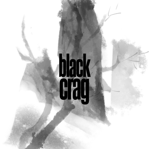
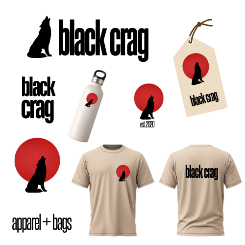
Once back from winter break, I figured I’d start with a logo and work my way outwards from there. This was my first attempt:
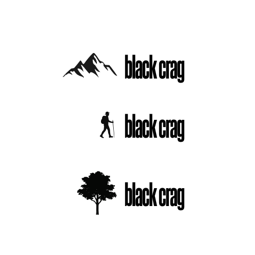
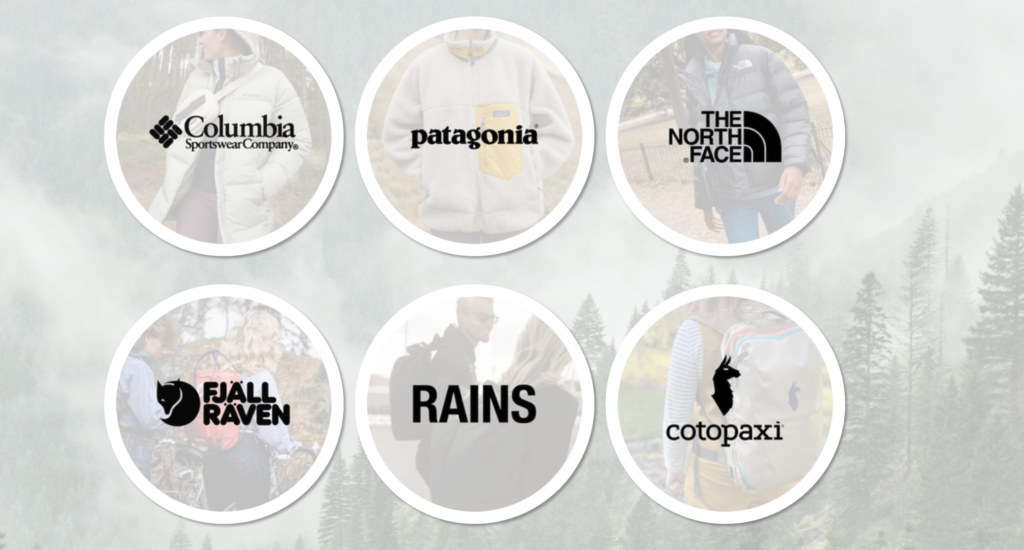
While I liked the moody tone, I knew accessibility and low contrast would become a concern. I decided to turn to outdoor clothes brands as inspiration, like Columbia Sportswear and The North Face. Their logos are a small icon on the left, with text extending outwards to the right. So I tried to see what that might look like:
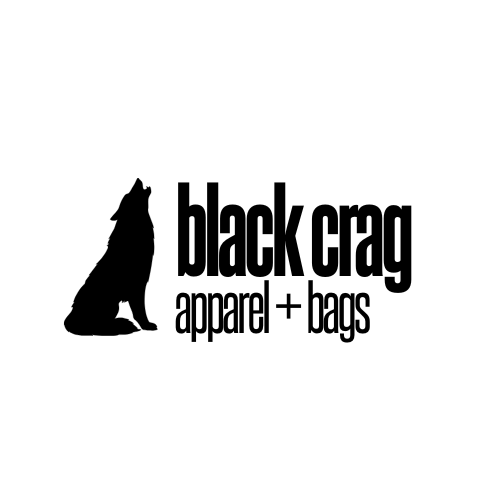
And ultimately, I decided on a wolf:
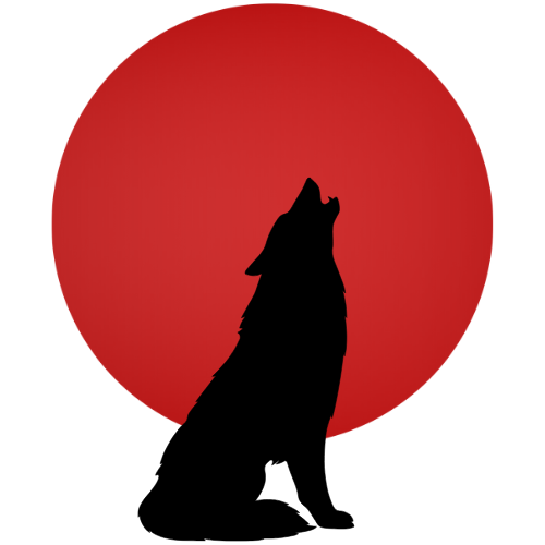
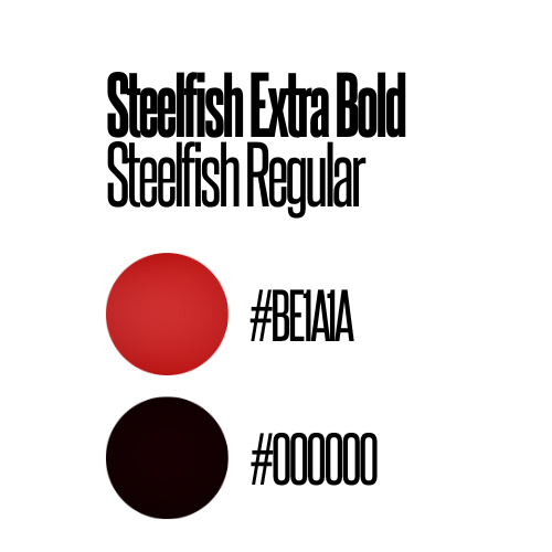
I also knew that while a horizontal logo is very useful, it’s also good to have a square visual for iconography and different formats. So I isolated the wolf and came up with this, which also led me to my accent color for the website:
Now I know that Black Crag doesn’t sell their own line of outdoors gear, but just in case they decide to go that route, I wanted to make sure the logo would look nice on merch. I also wanted to make sure it looked good on a price tag, since they might affix their own tags to other brands’ merchandise. Here are my mockups for that:
And since I was already playing around with mockups, I also compiled the logo information into a slide that I could share with a client for their brand guide:
Now, with the logo done, I felt I could move into website design. I was browsing sites like REI and The North Face and noticed there was a lot of large background imagery of the outdoors or people enjoying the great outdoors. These background images have become a staple for this industry’s visual layouts online, and I wanted the website to look as legitimate as possible. This forest on Pexels became my background, and The North Face website continued to inspire my layout for mobile.
I wanted to play with presenting the brands they carry in-store on their homepage, and I knew 6 would be a good number for a responsive grid. So I picked 6 brands and that’s what led me to creating the responsive grid of circles on the homepage.
This led to the feature I’m especially proud of on this project. I’ve been calling them my “brand bubbles.” They’re fully responsive and the borders were coded in CSS instead of in my image editor. However, I had a concern about them looking like buttons. They look like they should lead somewhere, especially since I added a subtle hover animation. But I don’t want to link them to the brand sites, because that would encourage consumers to buy the products online instead of coming to try them on in the store. For a client, I’d link these to an additional page on the website with specifics on what products are carried in the store. But I chose instead to focus my efforts on my responsive layout as opposed to more content creation within the context of this project, so I chose to leave them unlinked for now.
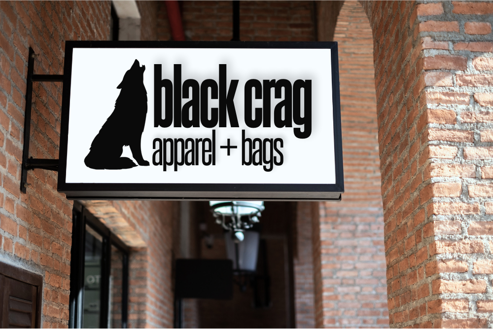
Once I had that and the nav bar, I knew I needed one more thing on the homepage to make it feel well-rounded and legitimate, so I pulled this shop image from Adobe Stock to make the storefront mockup:
Things kind of flowed naturally from there. Once I had a responsive nav bar and footer that I was happy with, I felt comfortable copying over my index HTML to make the additional pages. I made sure all the key things for a business were included – hours, Google Maps, phone number, email, – and just kept playing with things in Responsive Design Mode on Firefox Developer Edition until things looked right.
Ultimately, this project taught me how to generate visuals and images that worked with responsive design and forced me to dust off my responsive grid lessons from before the break. It felt good to create something that looks like a legitimate business after only being in this program for just a few months.
My major project website will be a curated, searchable, filterable digital library of tools for students and early-stage web designers and developers. I knew from the beginning I would want my project to solve a problem I have personally experienced. This concept not only does that, but one I’ve experienced during my studies in just the last few months. I’ve spent lots of my time not just working on homework, but sifting through the overwhelming number of bookmarks, duplicated tool lists, outdated resources, and scattered collections that make finding the right tool at the right time unnecessarily difficult. Existing toolkits often feel static, outdated, or bloated with irrelevant content, and they rarely reflect current topics such as ethical AI practices, sustainability, or accessibility-focused solutions.
The goal of my site is to function as a single, reliable reference point. One bookmark for all other bookmarks, that is refined, accessible, and continuously maintained. Because the site will be content-heavy and task-focused, UX design plays a critical role in its success. Without careful UX planning, a large tool database could easily become confusing, overwhelming, or unusable.
I will apply specific methods, such as user personas, empathy mapping, user journeys, accessibility planning, and usability testing, to shape the design, structure, and functionality of my website.
Understanding My Target Audience
The first step in my UX planning process was identifying who the website is for. Although the site could theoretically be useful to anyone interested in development and design tools, trying to create a site for “everyone” would weaken the project. So, for this site, my primary users are web design and web development students, recent graduates, and individuals in the first year of their web career. These users are often working to tight deadlines, learning new technologies quickly, and refining their personal workflow and process. They need fast access to trustworthy tools, clear explanations, and filtering systems that reduce cognitive load rather than add to it.
My secondary users include developers later in their career and self-taught learners. While they may have more experience, they could still benefit from a well-curated, up-to-date tool library that saves time and supports continued learning.
An easy pitfall for this project would be to just design my website for myself – as I am both a student and a new developer – but strategies like user research and user personas will help me look at my project from a top-down view and design for my entire user group.
Before the first crit, I will create a response form with open-ended but curated questions to post in the class Slack to gather needs, pain points, and perspectives from fellow students and recent graduates. However, in the meantime, I’ve explored the needs of my users in user personas (linked below). I plan to refer back to my form responses, as well as my user personas Stella and Nigel, as I approach each crit to make sure my ideas are still as user-centered as I initially intended them to be.
Stella is currently a student and has specific qualities that guide her decisions – lack of free time, an interest in sustainability, a disdain for AI, etc. Meanwhile, Nigel is one step further down his career path, having already graduated, and gravitates towards cutting-edge tech and AI. They each have a different set of core principles that influence their design choices, and I want my library to be useful to both of them.
Exploring Psychological Needs and Pain Points
Building on user personas, I made an empathy map to explore how users think, feel, see, and act when searching for web development tools. Frustration was a major driver for the creation of this project, so while that will remain a key starting place for this design, it’ll be important to think beyond myself and design inclusively for other developers who could be feeling an entire range of emotions as they work on their projects.
From my research and personal experience, many users:
Feel stressed when searching for tools
Feel uncertain about whether a tool is reliable or ethical
Resort to saving links randomly rather than organising them effectively for the sake of time
Dread learning a complicated new tool
While my initial concept factored in points 1, 2, and 3, the empathy mapping process exposed a potential gap in my plan with point number 4. I hadn’t yet considered avoiding certain tools if they look or sound too complicated. This is leading me to explore the additional features like integrating links to useful tutorials to new tools, or categorize them in a Beginner/Medium/Expert level of difficulty.
I also look forward to being able to consult my classmates on different pain points and challenges they may be experiencing during this year, and using those experiences to inform how my site can meet the needs of future individuals in our same career stage.
The User Journey: Shopping for Information
Planning how an individual moves through the site is key, given that one of the main challenges I hope to address is organization and workflow. A typical user journey might involve a student arriving at the homepage, searching for a specific category such as “color tools”, refining results using filters, such as “No AI” or “Free,” and clicking through to a tool that helps them complete their project.
I will my website’s search function feel similar to online shopping – first you may enter something in the search bar, like “tank tops,” and then it shows search results where you can either immediately start browsing, or further refine – like sorting by price, or filtering it to only show results that are in your size. I want the site to both allow users to browse, but also be able to find something specific quickly if that’s what they came to the site to do.
When it comes to concise, current descriptions with sources cited, the Progressive Voters Guide is a big inspiration for me. Their recommendations are supplemented with links, references, endorsements, a date when it was last updated, and alternative options if the user isn’t convinced by the recommendation. I love the way they organize information and hope to make my readers feel as informed and supported as I do when I read their site.
Accessibility and Inclusive Design
Accessibility is a central value of my major project, given that the site is aimed at students and new professionals with varying levels of ability, confidence, and access needs. During planning, I will consider accessibility at both structural and visual levels. This includes using semantic HTML to support screen readers, ensuring keyboard navigation works across filters and menus, and maintaining sufficient colour contrast for readability. Clear labels and predictable interactions will benefit not only users with disabilities but all users. The accessibility module of this course will be an opportunity to confirm that my site meets current web standards of visuals and backend structure.
I also plan to consider the accessibility of the content itself. Tool descriptions will avoid unnecessary jargon where possible, and filters will use language that reflects how users naturally describe their needs.
The accessibility of the tools I recommend will also be evaluated and noted in the descriptions I write. Part of my criteria for my database will be holding these tools to the same standards I am holding my own website to.
By embedding accessibility into the foundation of my site, I reduce the risk of retrofitting fixes later and making my project useful to as broad an audience as possible.
Ongoing UX Design and Listening to Users
UX design will not end for this project once this article is published. I will incorporate testing, feedback, and research among my peers into my timeline. I consider myself lucky to be surrounded by my target audience and plan to use that to my advantage as much as I can without burdening them too much on top of working on their own projects. The crits will be useful checkpoints that are already structurally embedded into the project, but utilizing Slack between crits allows for asynchronous feedback and testing which can be analyzed and implemented more thoroughly. Early research will be gathered through short questionnaires on Slack, and later on, I may request simple tasks, such as finding a tool for a specific purpose and to let me know if friction or errors occur.
I also want to embed listening to my users into the fabric of my site. I intend to create an area where people can suggest new resources, sending them to a place where I can review them and potentially add them. Because, let’s be honest – I’m not an expert. I’m a good Googler and a decent writer, but it’s just a fact that as time goes on and the deadline closes in on this project that I am going to miss something that should be in this toolkit. I want to invite users to help me make this site be the best it can be as much as they are willing to contribute to it. I will make the suggestion portal as low-friction and open-ended as possible – it can be as simple as just dropping a link and hitting “send,” or as thorough as writing an argumentative essay about why this is the state-of-the-art image compressor that everybody should be using, and leaving contact info in case I have further questions about why it absolutely must be published on my site. I look forward to hearing from individuals with the same shared goal as mine – to create the best possible resource for students and new developers.
Next Steps
This planning stage provided a foundation for the development phase of my major project, but there is much more to be done. Before the next crit, I plan to connect with my classmates, message past graduates and new developers, and supplement my skillset so I can pull off the functionality that I envision for this website. I also look forward to the upcoming accessibility module to ensure my toolkit meets cutting-edge inclusivity standards so that my toolkit isn’t just my toolkit – it’s a toolkit for all.
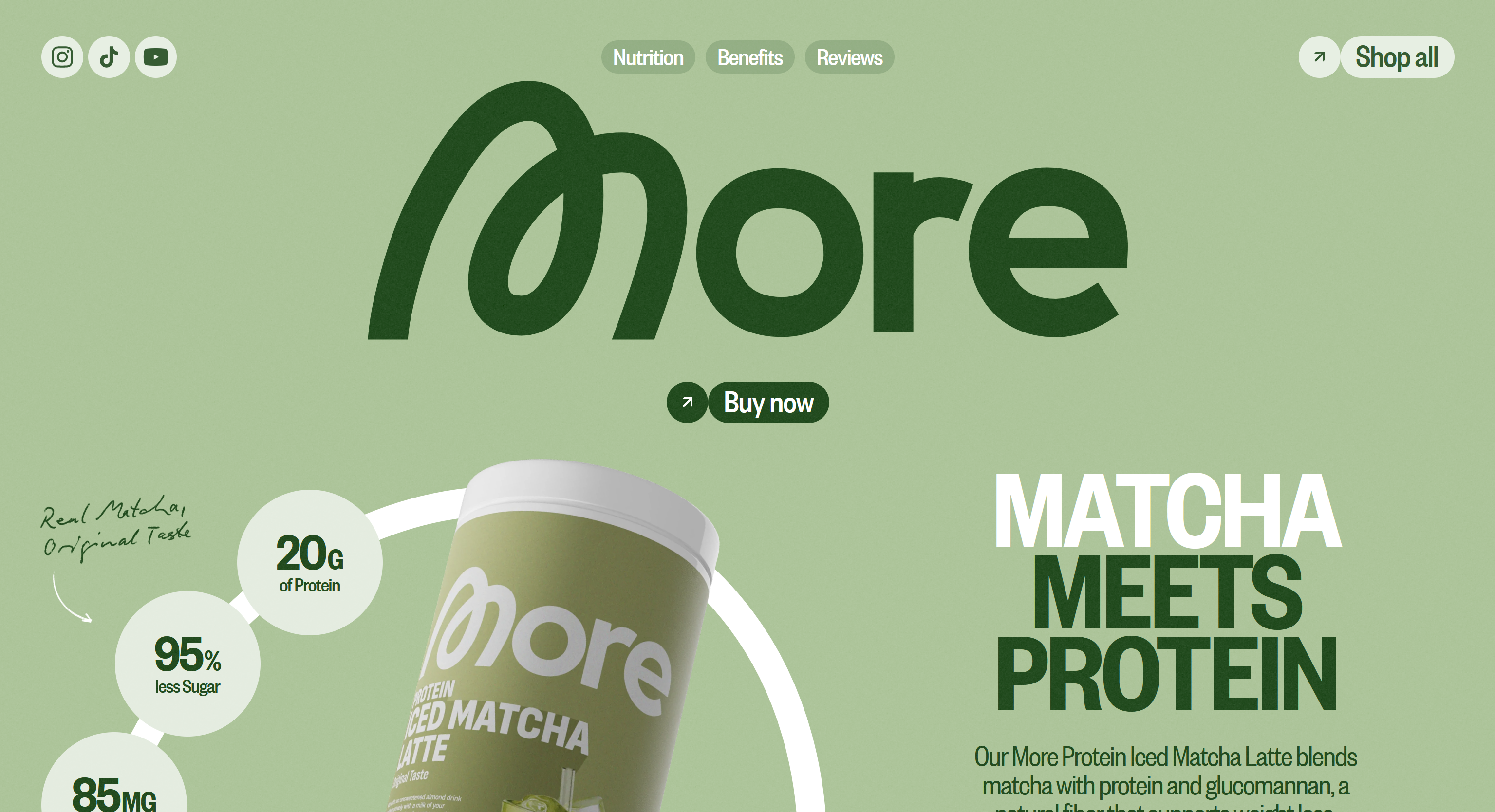
Even though it was made in Webflow (yuck!), I really appreciate the color scheme of this website. It uses the light minty color associated with matcha, for the background, which helps me, the consumer, immediately mentally connect this product to the taste of matcha. The dark green and white are great choices for accent colors that are readable and stylish over the matcha background color.
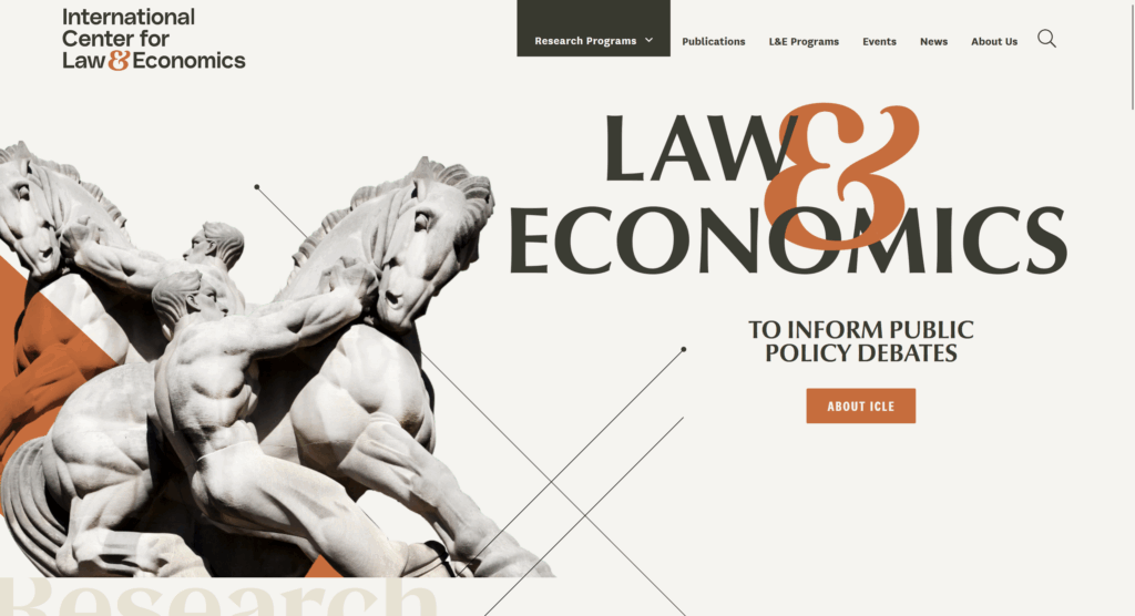
International Center for Law & Economics
The ICLE takes traditional boring museum/education colors and kicks it up a notch with a terracotta accent colors. I like the idea of just having one major color as a nice “pop” and then keeping the rest neutral. It makes the site still feel professional, but you can tell someone recently made an effort to modernize it.
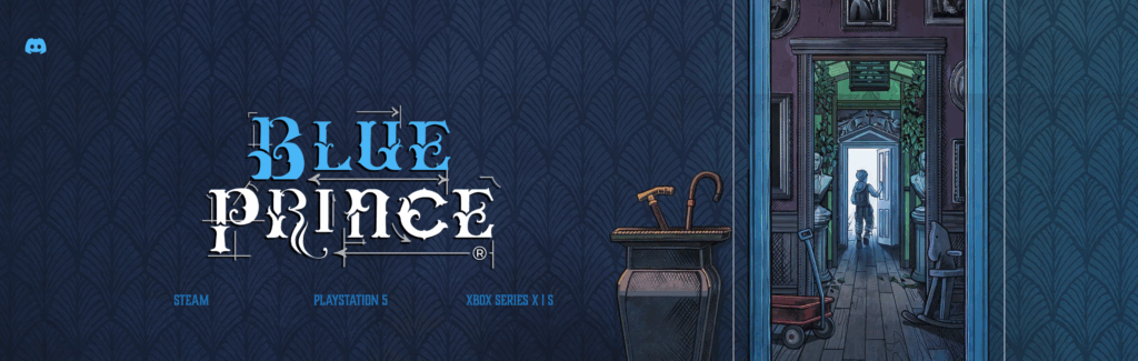
Blue Prince
Blue Prince is a visually stunning puzzle game that came out earlier this year (conveniently right around a major surgery for me, so my 2 weeks of recovery were completely dedicated towards this game). The sound design and visual design in the game is immersive, moody, and beautifully done. It’s teed up to win big at The Game Awards this year, which puts a lot of pressure on a website since jury members will be visiting it to evaluate it as a nominee! I think the studio did a fantastic job of capturing the ambiance of the game with this wallpapered header. This isn’t a direct screenshot from the game, this imagery was definitely made specifically for this purpose, and it does a great job bridging the gap from an interactive game to a 2D webpage.
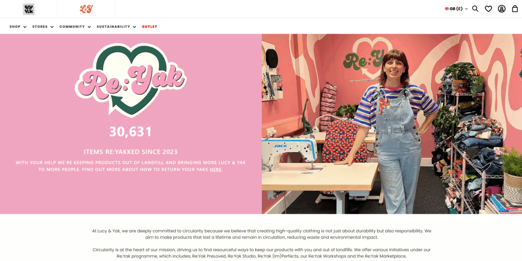
Lucy & Yak is a whimsical, colorful, UK-based clothing brand. Their logo has always been a silly, curvy, youthful font, however, their website manages to strike a balance between their brand style and readability. They use bold sans-serif subheads and standard sans-serif paragraph text. I’ve always enjoyed exploring their website.
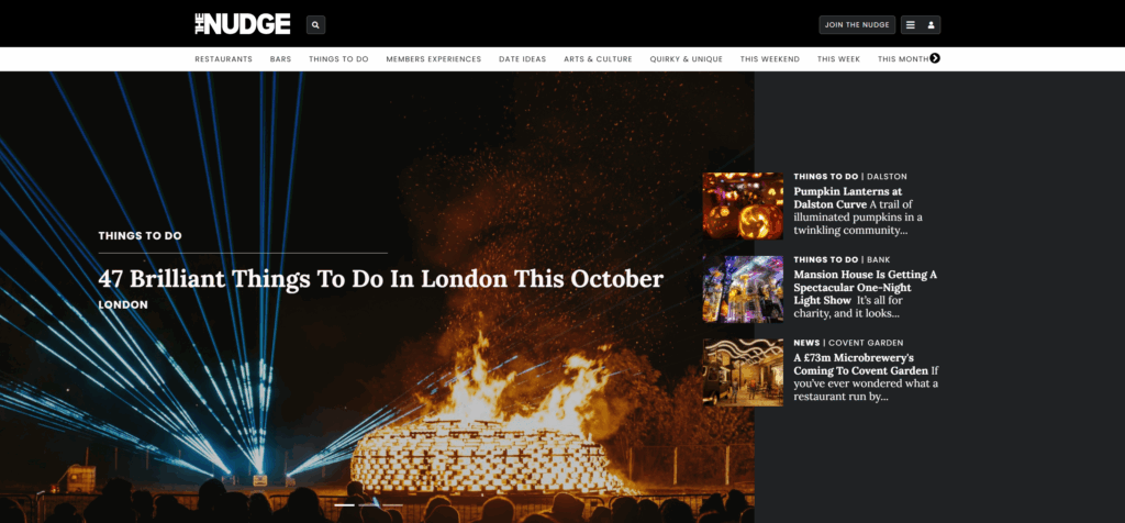
The Nudge
The Nudge is a trendy events service that lets you know of major happenings in large cities. Their website is a blend between thin sans-serif subheads and newsy serif headlines. I like how the styles they select emulate a newspaper, while also being updated and readable.
Teenage Engineering
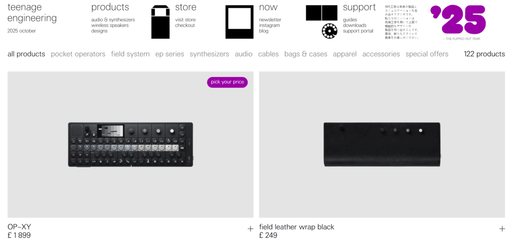
Okay, this is my one pick that’s a little more “out there” – Teenage Engineering is an audio/synthesizer brand that creates high quality luxury products to add to a bedroom music studio. Their brand is techy and also a bit silly. I’ve always liked shopping on their store because it really feels like you’re buying from a high-end company, with the large editorial images and thin font. Also, from a structure standpoint, I love how their header is structured like a dropdown menu without the actual dropdown mechanic. It feels bare-bones, like the user is in control to add the creativity layer, which is how their products feel when you use them.
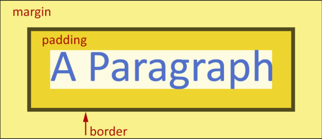
This week, we added the CSS layer to our three designed objects website. I found this week much more difficult than the HTML week, because I have a hard time visualizing the end result as I’m messing with the code. I am also struggling with the margin vs. border vs. padding differences, but the infographic below has helped inform what I did for my website this week.
I still haven’t fully decided how I want my website to look, but I put in some basic styling to prove I did at least learn something this week! I can always go back and change it later if I get struck with divine inspiration.
This week, I created a simple, 4-page website to display my 3 well-designed objects.
Last week, we created what David called “the content layer,” by analyzing three objects and taking photos. With the HTML, we’re adding “the structure layer,” and will eventually add “the presentation layer” with CSS.
By removing the CSS element in this project, I was forced to redirect my inherent instinct to make things look pretty towards my code instead of the end output. I experimented with unordered lists, unicodes, and hyperlinks to make my structure layer accessible, readable, and attractive without any external styling.
I look forward to next week because I don’t love the look of the bullets on my unordered list, and I want the navigation between pages to look prettier (maybe buttons or a menu?) but that will be tackled in the presentation layer.
Resources I used this week
<img> MDN – Useful reference for formatting images in my code editor.
David’s explainer on images – This had more context on modern formatting than MDN, such as removing the / when closing the element.
<ul> MDN – Useful reference for formatting my three objects on my homepage.
&what – Library of HTML codes for en dashes and other handy symbols.
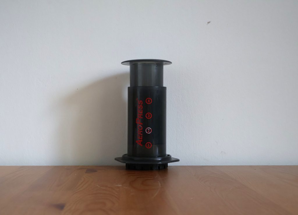
The AeroPress is essentially a smaller, simplified French press. It has evolved and experienced minor changes over time, but the core of it has stayed relatively the same since it was invented 20 years ago. Made from BPA-free plastic, the AeroPress consists of a cylindrical tube, a plunger to go in it, and a cap that holds a paper filter. The plunger has a silicone seal (which can be removed for cleaning) and is pressed down over hot water and coffee grounds, forcing the mixture through the filter. It makes one cup of coffee, perfect for an individual who doesn’t need an entire pot of coffee.
It’s lightweight enough that you can easily fit it into a backpack or container and bring it on a trip (for example, moving from Seattle to England for your master’s degree in Web Design and Content Management). The plastic material makes the product relatively affordable, easy-to-clean, and it lasts a long time. Even though you can order individual parts for replacement as necessary, I have never heard of anyone breaking or damaging their AeroPress with reasonable use. The only thing that needs restocking is the paper filters, and you can purchase a year’s supply for £8.99 online or at most coffee shops.
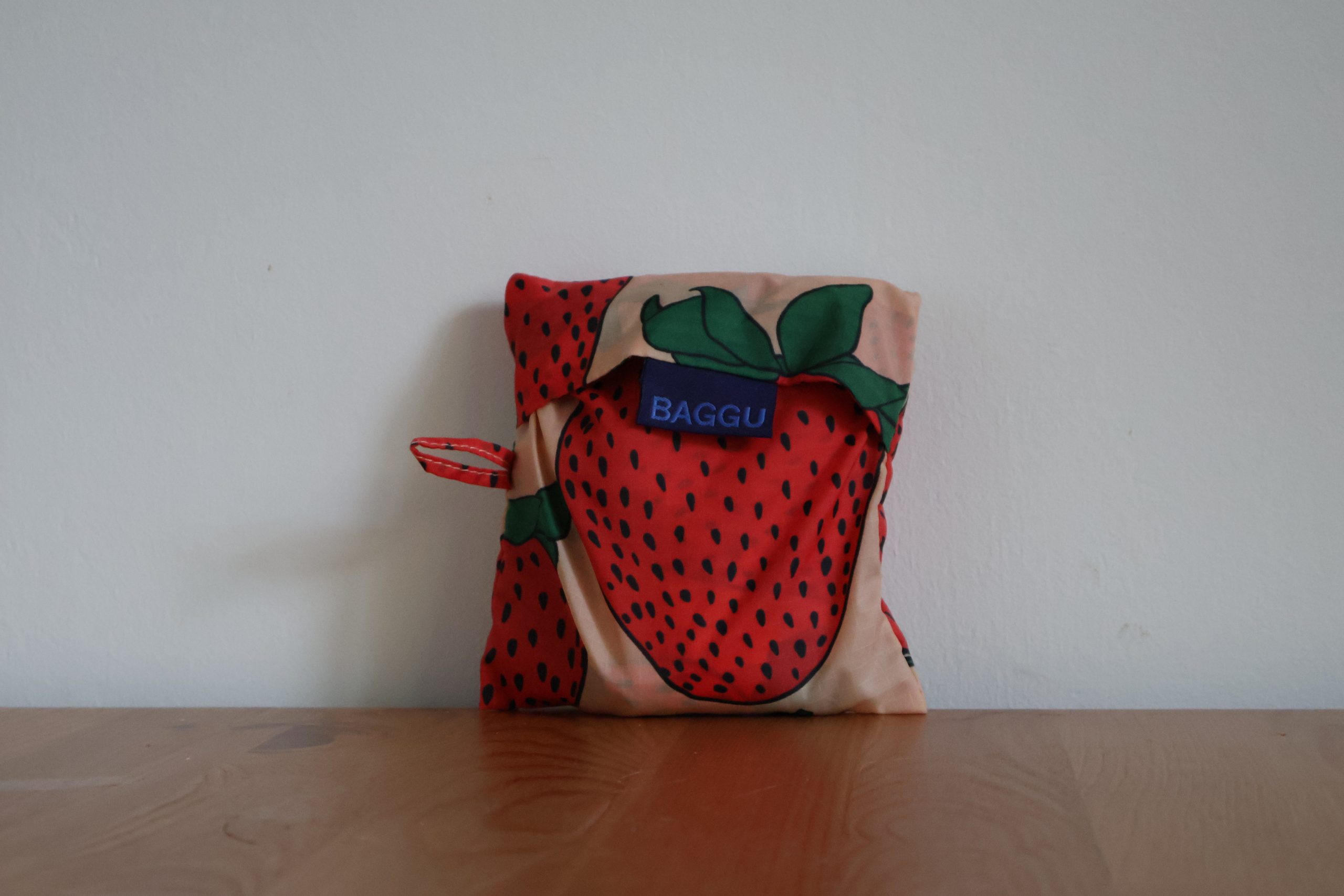
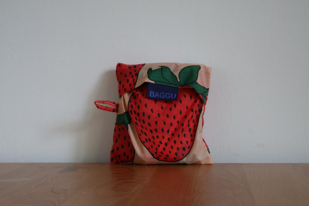
Baggu
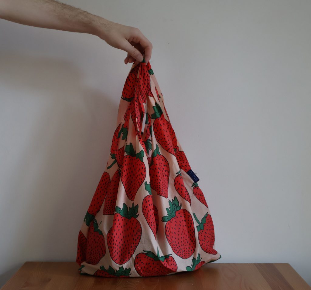
Baggu bags are a durable, sustainable, packable American bag brand. Items that live at the intersection of stylish and practical are hard to come by, and Baggu provides them in spades. These completely indestructible bags come in lots of cute prints, pack down to the size of a playing card, and are – most importantly – machine washable. I’ve been a proud Baggu user for years and don’t see myself stopping anytime soon (in part because my bags are still as good as new).
A standard Baggu bag is $14. It fits in your purse or even in your pocket. It carries 2-3 plastic grocery bags worth of groceries up to 40lbs comfortably in hand or over your shoulder. I don’t leave the house without one, since it hardly takes up any space, and now if I stop in a store on the way home spontaneously, I’m ready with a bag. The amount of bag costs I’ve avoided over the years by having a Baggu ready for an unforeseen shopping trip has more than paid off the cost of the bag.
They also come in mini sizes and extra-large sizes, but I’ve never had any issue with the standard size. It has transported my board games, contributions to friends’ dinner tables, thrift store finds, and groceries and it still looks the same as when I bought it. My pantry has seen many “reusable” bags come and go over the years due to ripping or sticky stains, but I’ve never needed to replace a Baggu.
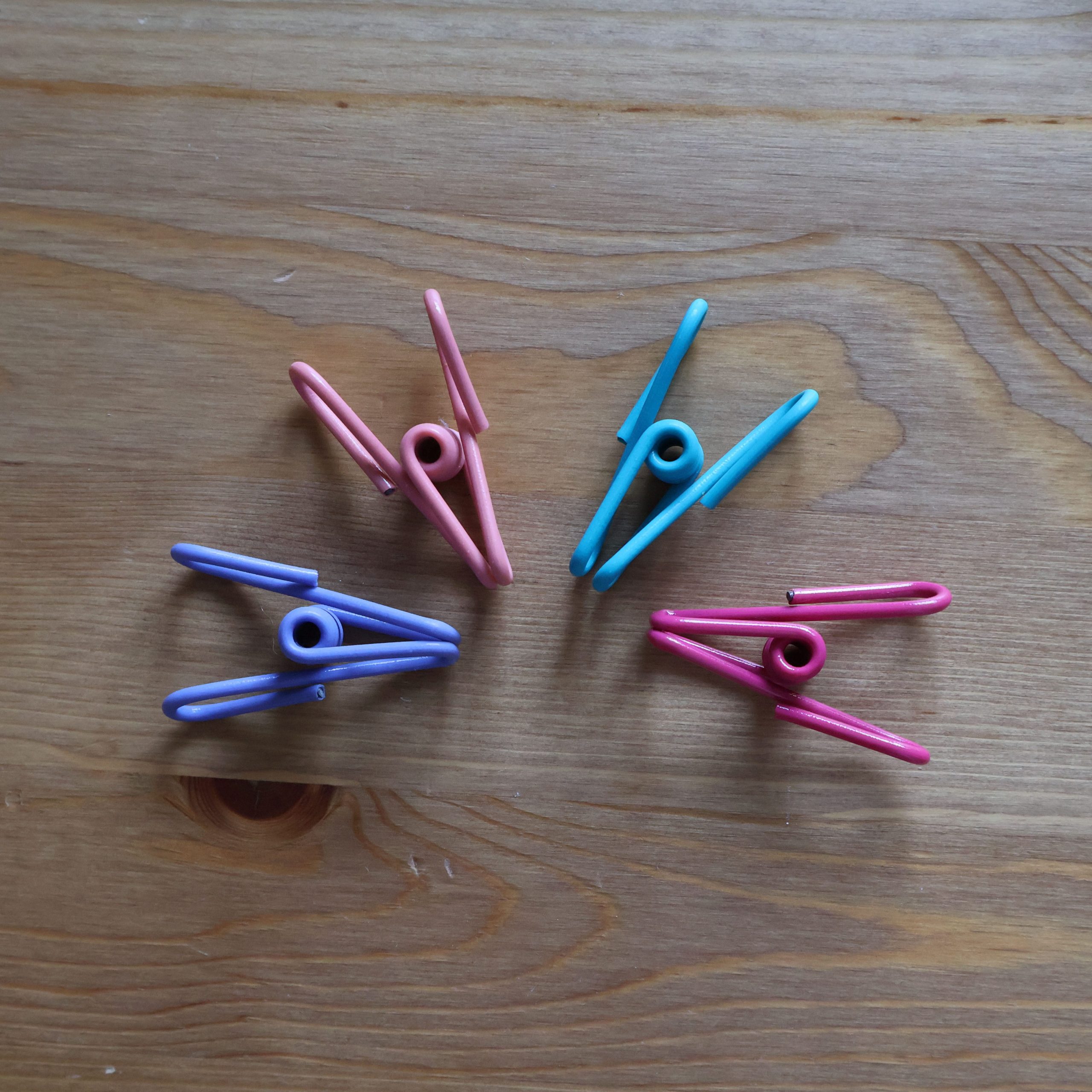
Clips
These PVC-coated wire-based clips have moved kitchens, states – and now, countries – with me. Far outliving any clothespin I’ve encountered, these multipurpose clips have pinched chip bags, flour bags, cereal, laundry, craft projects, and more for the better part of the last decade. For me, the material has proved stronger than plastic alternatives or wood with a metal spring. The 2-inch clips comfortably withstand temperatures in the refrigerator and freezer, and can be easily cleaned with soap and water.
This was one of those purchases that I didn’t necessarily intend to keep forever, it was a replacement for past items that had broken and have just… lasted. And I can’t find a single aspect to nitpick. I had no idea they were so durable when I bought them (otherwise I probably would’ve gotten more!), since they weren’t expensive whatsoever, but clips like this remind me that the right purchases can last a long time if you choose wisely and treat them well.
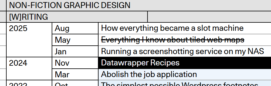
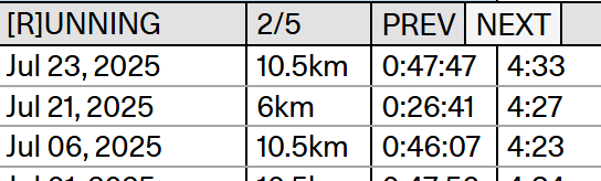
Germany-based graphics reporter Max Kohler has a portfolio website that really speaks to me as a project manager and organization nerd. He’s taken a love of spreadsheets to the next level with a graph-themed display of nearly ten years’ worth of content he’s created. He’s found a way to collect all of his projects, writing, teaching, and social media links in one place as a snapshot of his career. Initially it’s a bit overwhelming, but he’s implemented a purple-pink ombre in the background and a feature for the cursor to highlight specific cells, which makes the website straightforward to digest once you understand what you’re looking at.
His personality also shows through. Despite the inherent formality of spreadsheets, you can tell he has a sense of humor. Beyond career-oriented topics like his past work and courses, he’s listed whimsical, non-career-related line items like his top running times, and his closest friends. It’s clear that Max is a silly person who takes his design and his work very seriously, which is an impression I want to emulate in my career.
This one was made with Wix, but I feel like there’s a trend or stereotype to Wix-made portfolios that this breaks out of. I associate Wix sites with oversized images, flashy templates, and several different pages splitting up portfolios, CVs, and a contact page. At the end of the day though, all most people really need is a one-pager that’s well-organized and easy to read, like this one.
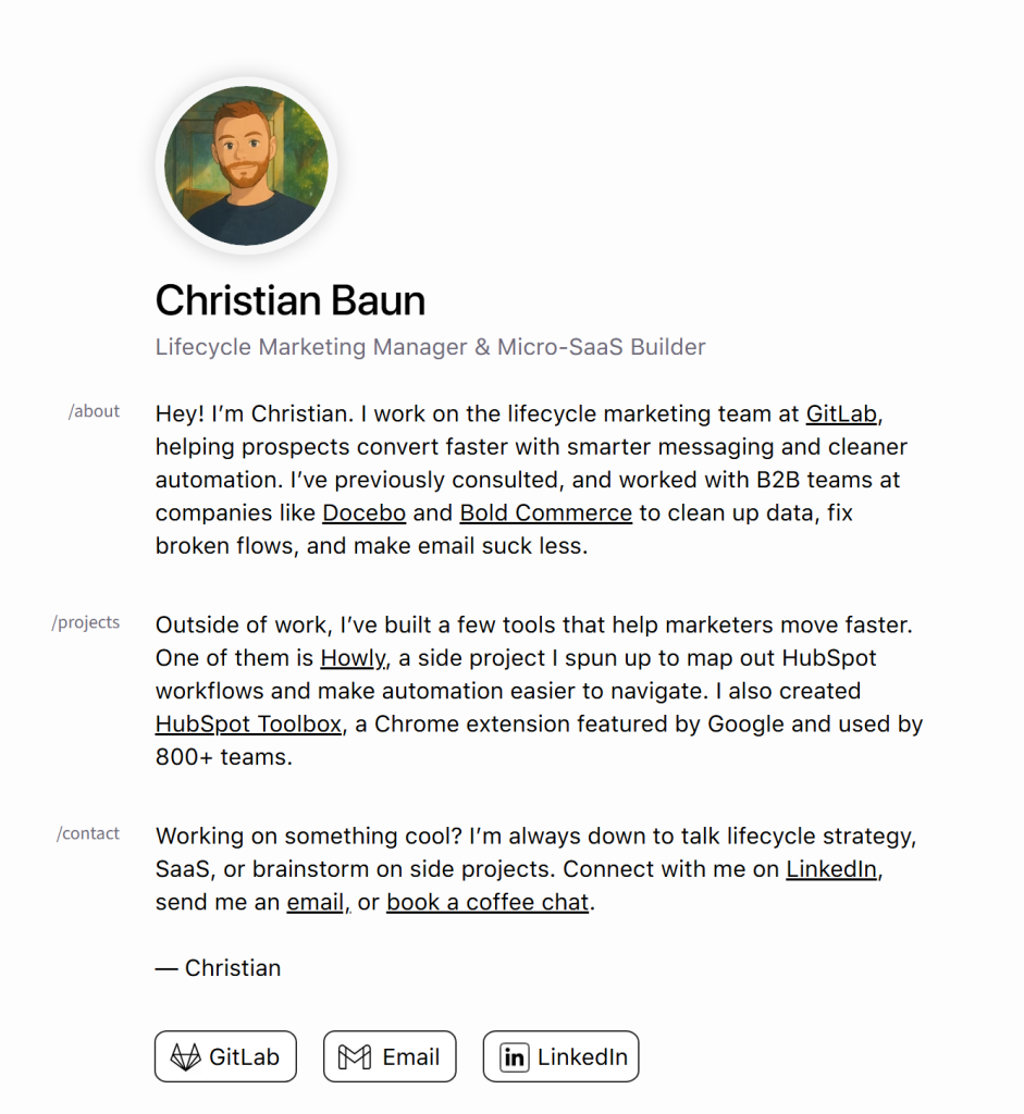
This digital CV was made by Canadian marketing manager Christian Baum, and hits all the notes you want a CV to hit. He describes who he is, what he’s capable of, listed some past projects, and how best to reach him. He’s cleanly hyperlinked all the relevant projects and profiles so it’s easy to navigate to anything that would be pertinent to hiring him. You really can’t beat this kind of simplicity. I can definitely see myself whipping up a resume like this in the future, since it’s just a little more elevated than the traditional PDF and shows a base level of tech-savvy and aesthetic eye.
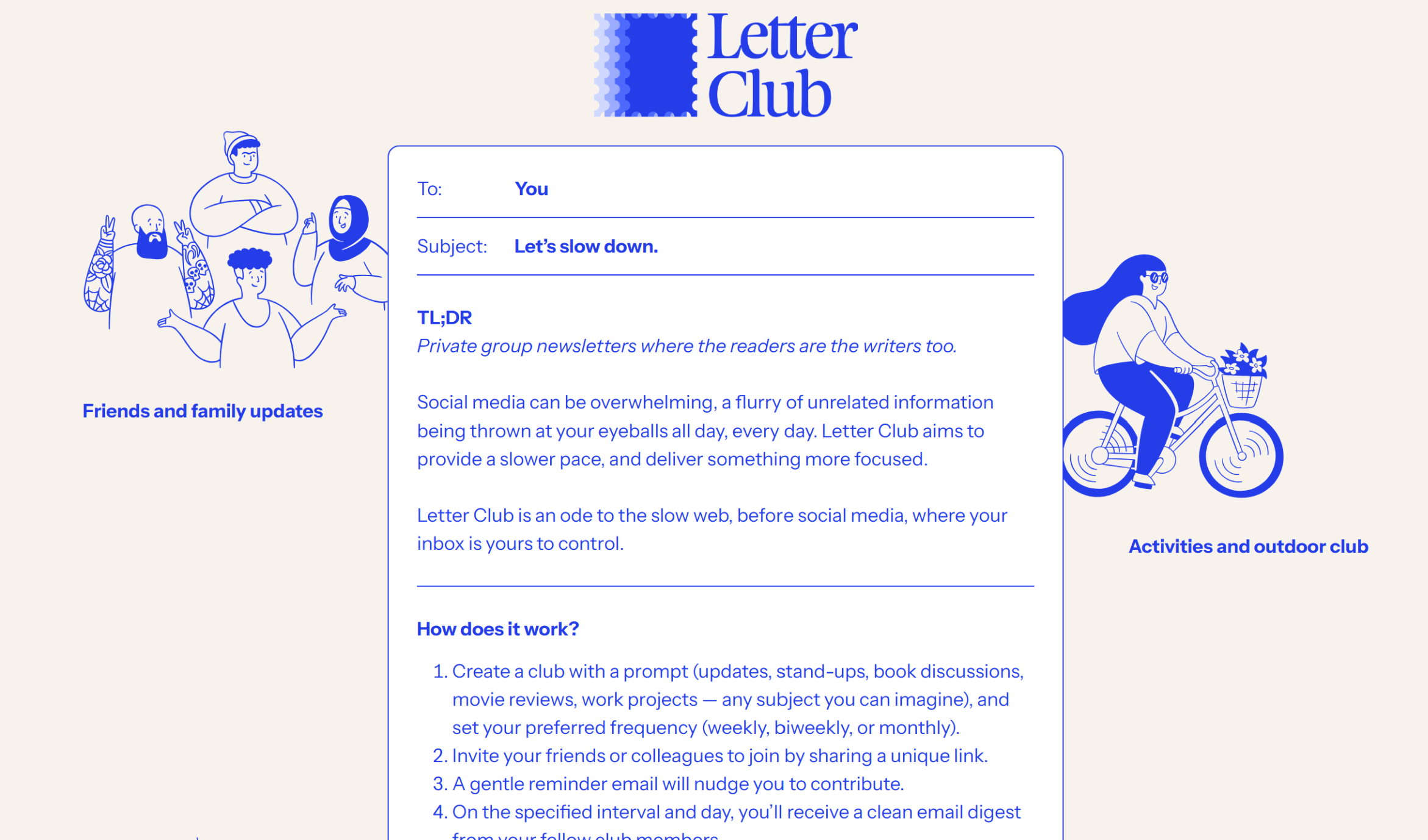
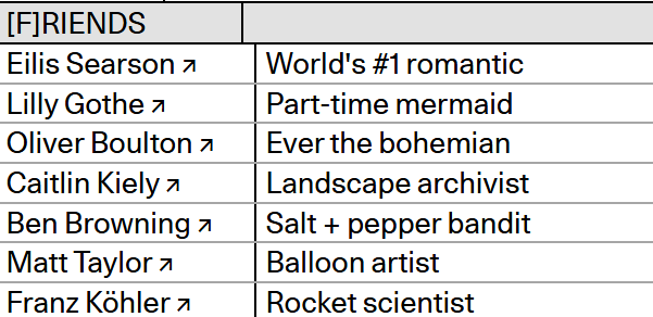
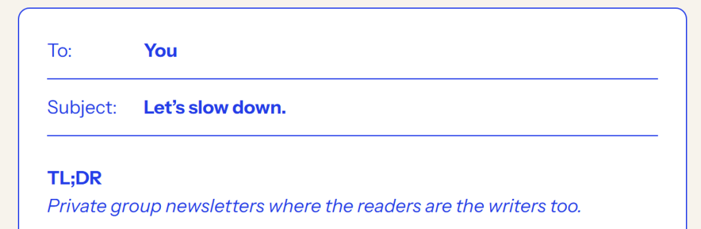
Letter Club has a website at the intersection of both encapsulating what the product is for, and a cute, colorful brand aesthetic. Often, flashy branding can backfire by not giving any kind of impression of what the product is about. However, the core of Letter Club’s website shows exactly what they’re about – emails. The necessary information is formatted like an email, which tells you right off the bat what this information is going to be about. Upon that, they’ve layered the fun doodles and blue text, but it doesn’t overpower the fact that it’s email-related.
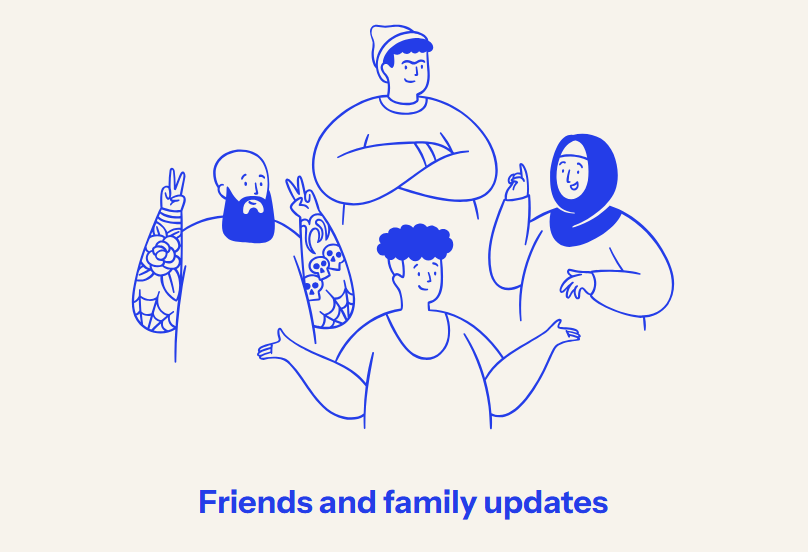
The blue doodles on the side illustrate different ways you could use Letter Club: for friends and family or for a club. It makes it easy to visualize yourself using Letter Club, and the website is tailored to move the images neatly to the bottom if you shrink your browser size, so it doesn’t clutter the text.
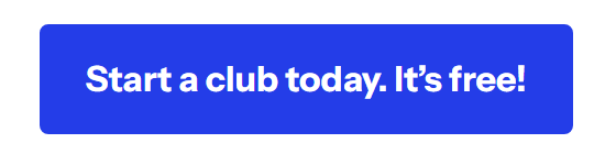
They’ve also got a call-to-action button at the bottom, drawing the eye down with the key blue color. I also appreciate that the button notes that it’s free, since that would be my first question as a potential user – and they’ve already answered it. Great marketing, great user acquisition, and a great overall design.