
Lucy & Yak
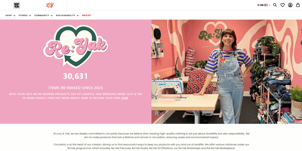
Lucy & Yak is a whimsical, colorful, UK-based clothing brand. Their logo has always been a silly, curvy, youthful font, however, their website manages to strike a balance between their brand style and readability. They use bold sans-serif subheads and standard sans-serif paragraph text. I’ve always enjoyed exploring their website.
The Nudge
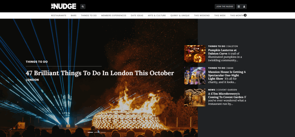
The Nudge is a trendy events service that lets you know of major happenings in large cities. Their website is a blend between thin sans-serif subheads and newsy serif headlines. I like how the styles they select emulate a newspaper, while also being updated and readable.
Teenage Engineering
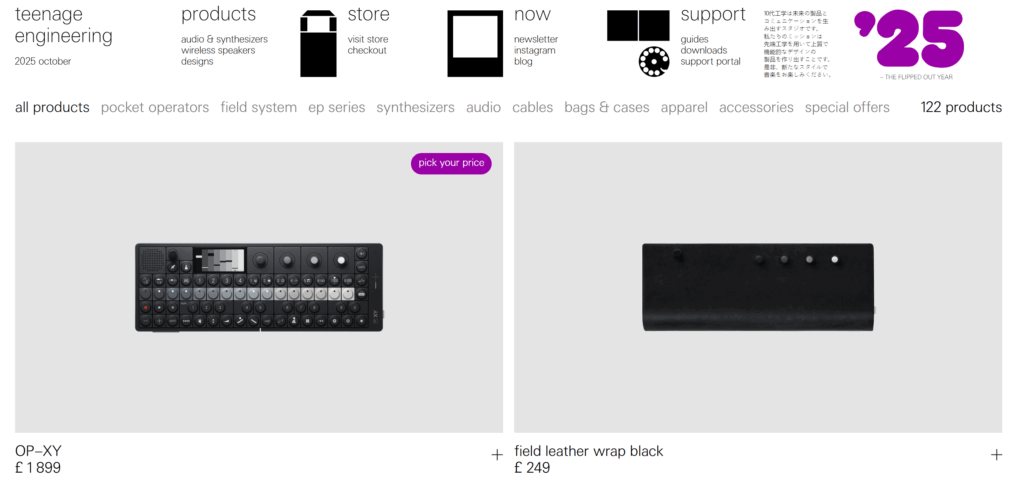
Okay, this is my one pick that’s a little more “out there” – Teenage Engineering is an audio/synthesizer brand that creates high quality luxury products to add to a bedroom music studio. Their brand is techy and also a bit silly. I’ve always liked shopping on their store because it really feels like you’re buying from a high-end company, with the large editorial images and thin font. Also, from a structure standpoint, I love how their header is structured like a dropdown menu without the actual dropdown mechanic. It feels bare-bones, like the user is in control to add the creativity layer, which is how their products feel when you use them.
resources i used this week
- Butterick’s Practical Typography
- next-sibling combinator | MDN
- How to Choose a Font | Douglas Bonneville
- Fonts In Use
Key Rules/Takeaways for Typography
- A good starting place is to define font-family, font-size, line-height, text-align, font-weight, and font-style.
- You’ll want a minimum of four fonts in your font-family stack.
- Optimize font use and only load the fonts you’re using.
- You’ll generally want 2 typefaces for most formatting circumstances.
Leave a Reply