
For my project, once I realized that nearly everyone in the class was doing Black Crag, I wanted to a) set myself apart, and b) ensure that my vision isn’t compromised by seeing other people’s interpretation of the brand. To set myself on the right path, I created these mood boards prior to winter break, just to have something to come back to after the time off so I wasn’t starting from scratch. Surprisingly, looking back at the mood boards now, while a lot of the nitty gritty details (colors, fonts) changed, the overall vibe stayed the same (moody, outdoorsy).
Once back from winter break, I figured I’d start with a logo and work my way outwards from there. This was my first attempt:
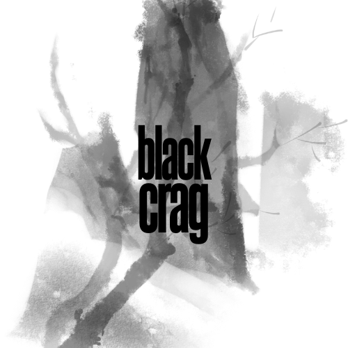
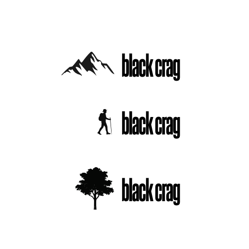
While I liked the moody tone, I knew accessibility and low contrast would become a concern. I decided to turn to outdoor clothes brands as inspiration, like Columbia Sportswear and The North Face. Their logos are a small icon on the left, with text extending outwards to the right. So I tried to see what that might look like:
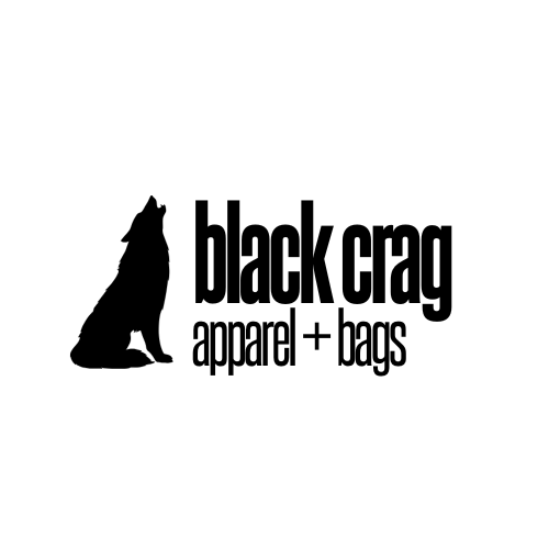
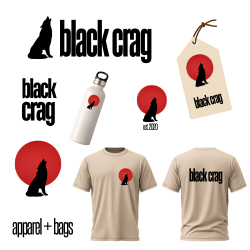
And ultimately, I decided on a wolf:
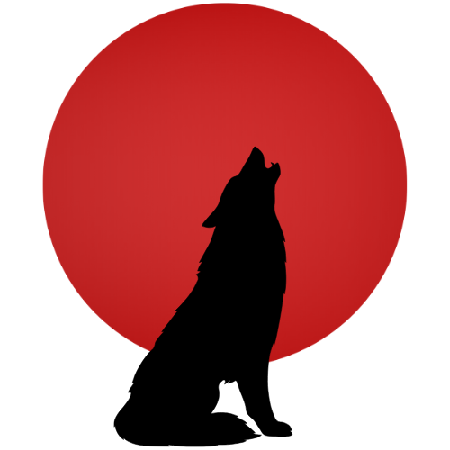
I also knew that while a horizontal logo is very useful, it’s also good to have a square visual for iconography and different formats. So I isolated the wolf and came up with this, which also led me to my accent color for the website:
Now I know that Black Crag doesn’t sell their own line of outdoors gear, but just in case they decide to go that route, I wanted to make sure the logo would look nice on merch. I also wanted to make sure it looked good on a price tag, since they might affix their own tags to other brands’ merchandise. Here are my mockups for that:
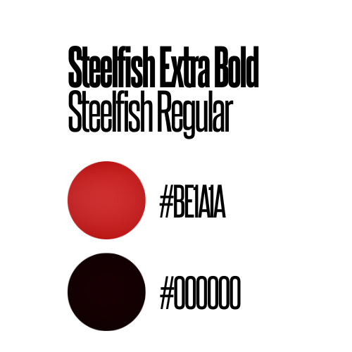
And since I was already playing around with mockups, I also compiled the logo information into a slide that I could share with a client for their brand guide:
Now, with the logo done, I felt I could move into website design. I was browsing sites like REI and The North Face and noticed there was a lot of large background imagery of the outdoors or people enjoying the great outdoors. These background images have become a staple for this industry’s visual layouts online, and I wanted the website to look as legitimate as possible. This forest on Pexels became my background, and The North Face website continued to inspire my layout for mobile.
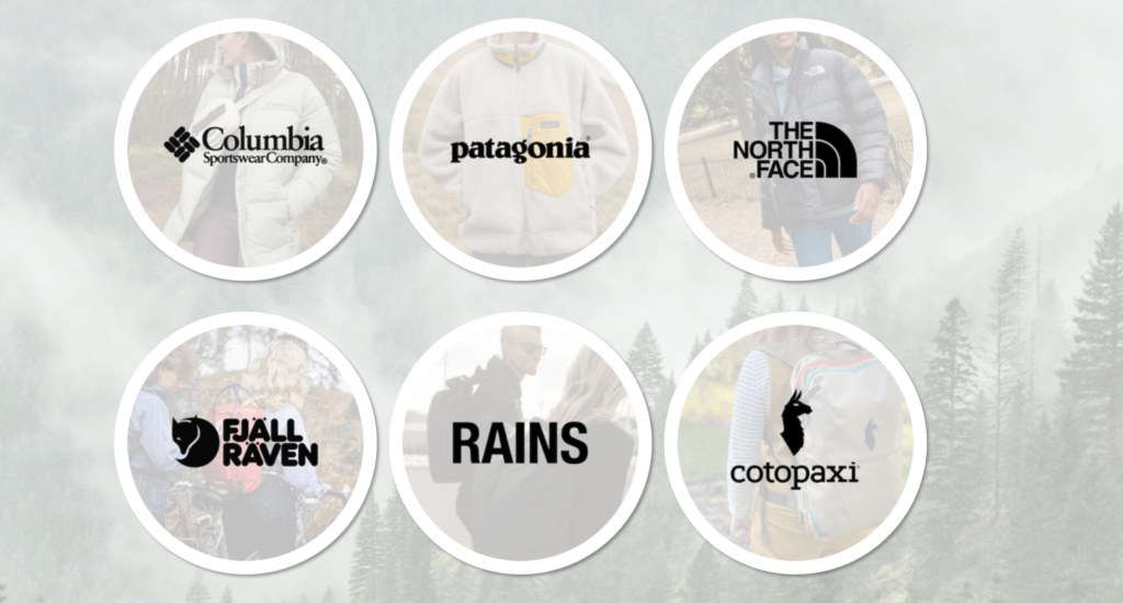
I wanted to play with presenting the brands they carry in-store on their homepage, and I knew 6 would be a good number for a responsive grid. So I picked 6 brands and that’s what led me to creating the responsive grid of circles on the homepage.
This led to the feature I’m especially proud of on this project. I’ve been calling them my “brand bubbles.” They’re fully responsive and the borders were coded in CSS instead of in my image editor. However, I had a concern about them looking like buttons. They look like they should lead somewhere, especially since I added a subtle hover animation. But I don’t want to link them to the brand sites, because that would encourage consumers to buy the products online instead of coming to try them on in the store. For a client, I’d link these to an additional page on the website with specifics on what products are carried in the store. But I chose instead to focus my efforts on my responsive layout as opposed to more content creation within the context of this project, so I chose to leave them unlinked for now.
Once I had that and the nav bar, I knew I needed one more thing on the homepage to make it feel well-rounded and legitimate, so I pulled this shop image from Adobe Stock to make the storefront mockup:
Things kind of flowed naturally from there. Once I had a responsive nav bar and footer that I was happy with, I felt comfortable copying over my index HTML to make the additional pages. I made sure all the key things for a business were included – hours, Google Maps, phone number, email, – and just kept playing with things in Responsive Design Mode on Firefox Developer Edition until things looked right.
Ultimately, this project taught me how to generate visuals and images that worked with responsive design and forced me to dust off my responsive grid lessons from before the break. It felt good to create something that looks like a legitimate business after only being in this program for just a few months.
Leave a Reply