
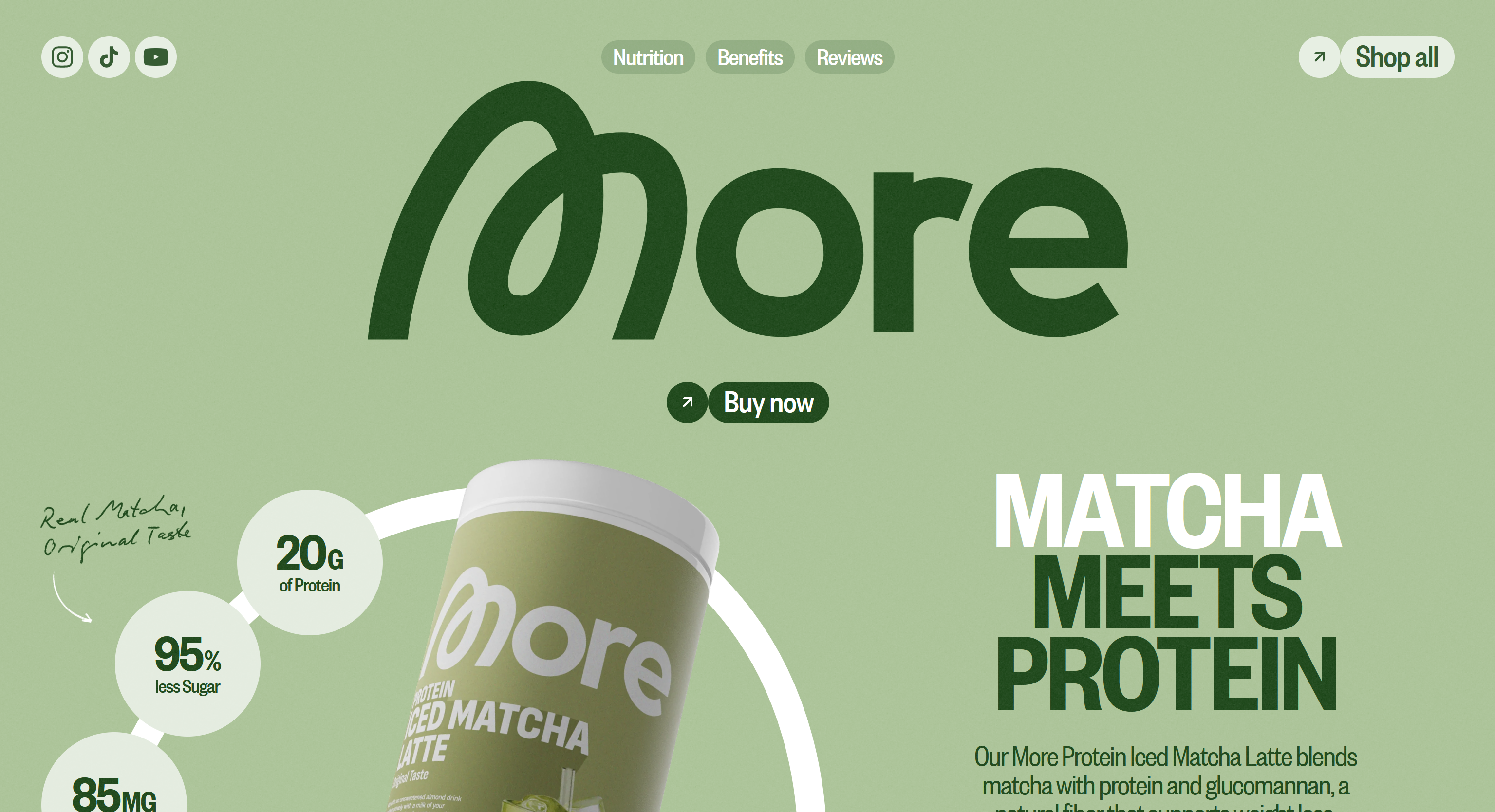
More Nutrition
Even though it was made in Webflow (yuck!), I really appreciate the color scheme of this website. It uses the light minty color associated with matcha, for the background, which helps me, the consumer, immediately mentally connect this product to the taste of matcha. The dark green and white are great choices for accent colors that are readable and stylish over the matcha background color.
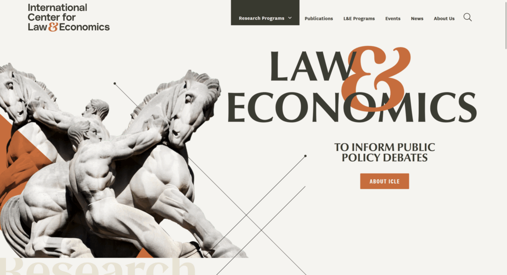
International Center for Law & Economics
The ICLE takes traditional boring museum/education colors and kicks it up a notch with a terracotta accent colors. I like the idea of just having one major color as a nice “pop” and then keeping the rest neutral. It makes the site still feel professional, but you can tell someone recently made an effort to modernize it.
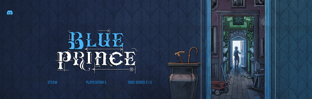
Blue Prince
Blue Prince is a visually stunning puzzle game that came out earlier this year (conveniently right around a major surgery for me, so my 2 weeks of recovery were completely dedicated towards this game). The sound design and visual design in the game is immersive, moody, and beautifully done. It’s teed up to win big at The Game Awards this year, which puts a lot of pressure on a website since jury members will be visiting it to evaluate it as a nominee! I think the studio did a fantastic job of capturing the ambiance of the game with this wallpapered header. This isn’t a direct screenshot from the game, this imagery was definitely made specifically for this purpose, and it does a great job bridging the gap from an interactive game to a 2D webpage.
Leave a Reply